Reimagining Hour-by-hour Weather Data
To grow the audience in the new subscription tier of our app, the AccuWeather UIUX team was tasked with creating a more robust and easily scannable hourly experience that incorporates contextual upsell opportunities.
Role
UX Designer & Researcher
Timeline
3 months
Programs
Figma & PlaybookUX
Date Completed
December 2022
High Level Result:
Mobile subscription gross revenue increased from $150k monthly to a peak of $1.1m monthly.
Design Process
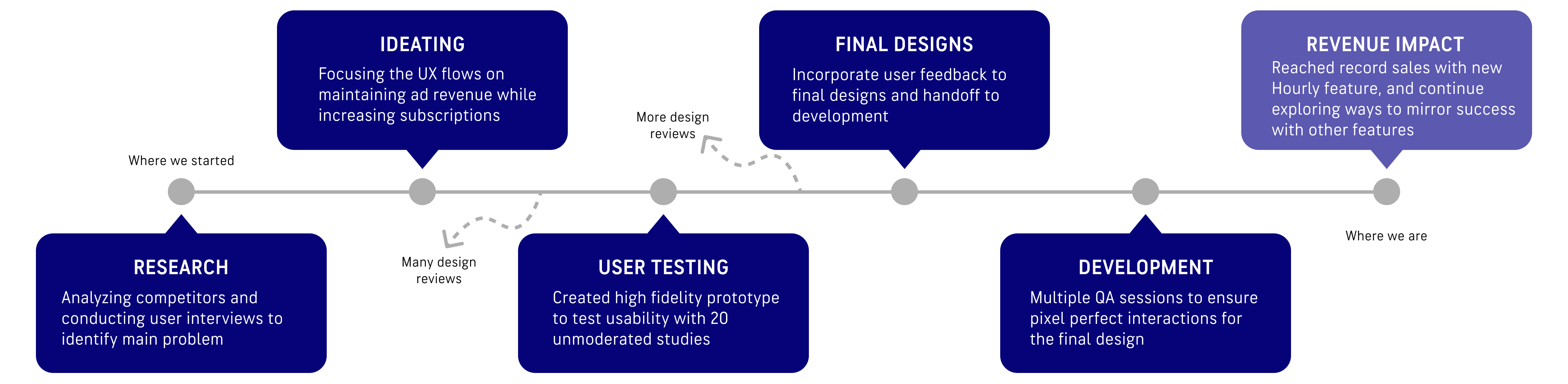
Research
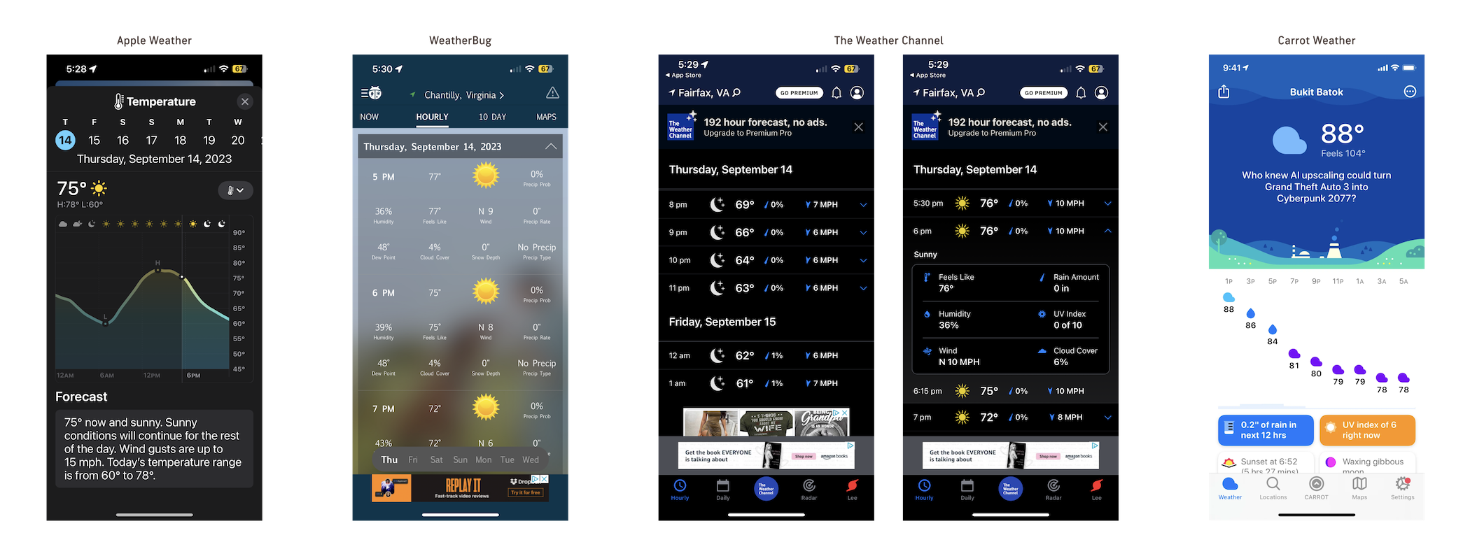
Competitor Analysis
Most of our weather app competitors either had just a Graph view or a version of List view to display hourly weather data. Both views had their pros and cons as Graph view is best for a quick overview of the entire day but harder to gauge the specific details of each hour, while List view had the details but lacked the quick, scannable experience. Because of the strengths of both styles of data visualization, both views are necessary for a more robust hourly experience that will also set the AccuWeather app apart from our competitors.
User Interviews
I conducted external interviews with Weather app users about how they view the hour-by-hour forecast on their favorite weather app to determine the biggest pain points and strengths of the different Hourly views available.
“I usually use [the Hourly page] to get a general idea of what the weather will look like during the day, usually the first thing in the morning. Most important data for me is the chance of rain and the peak and low temperature of the day.”
Corporate employee who works from home, 26 (Main weather app: Apple Weather)
“I like looking at the details for specific hours every day since I have a consistent schedule of when I’m outside dropping my kids off at school or picking them up. Otherwise I’m usually inside so I don’t need to know every detail of every hour.”
Parent with strict daily schedule, 35 (Main weather app: Weather Channel)
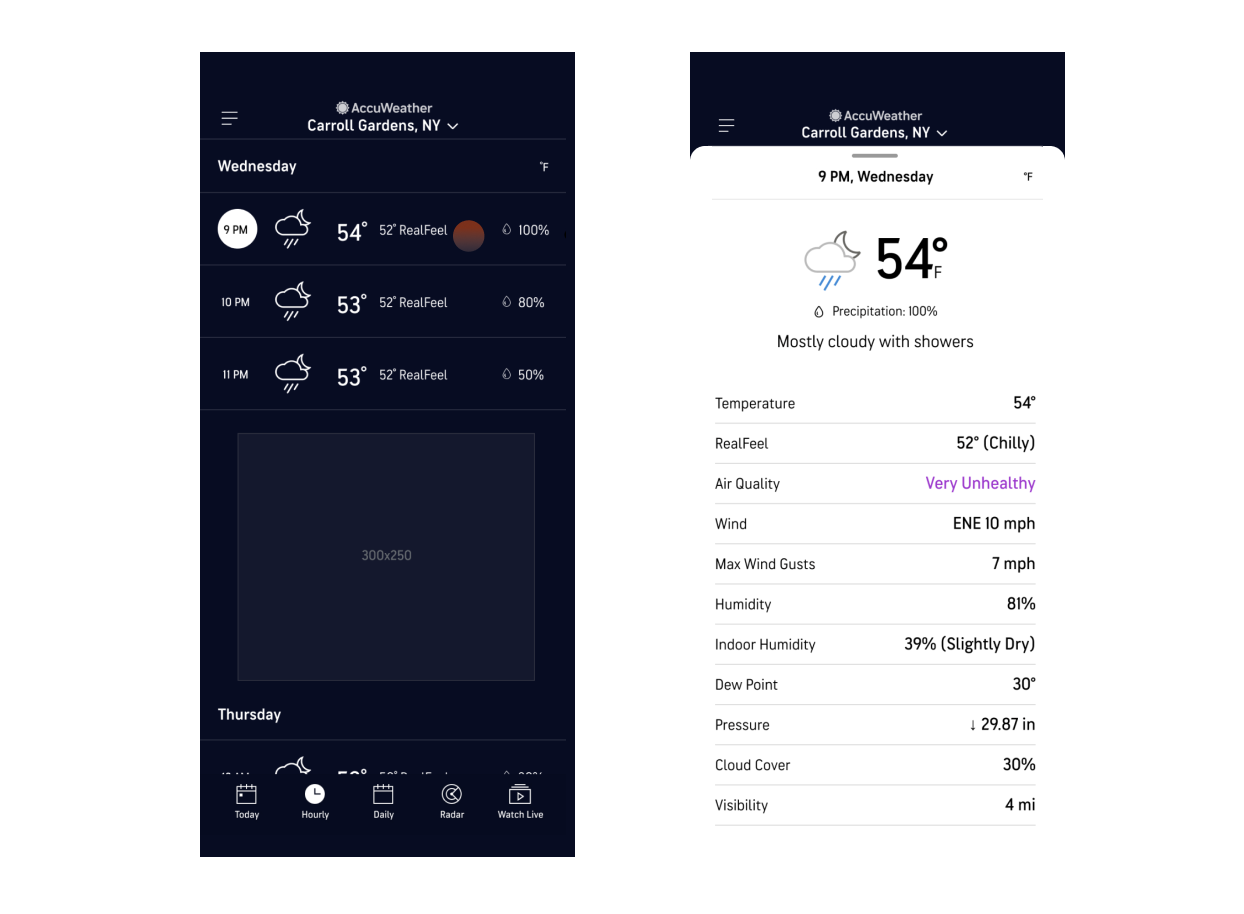
Our Old Experience Analysis
The old AccuWeather Hourly page only had a List view that showed around 3-5 hours on landing (with ads in between) that makes seeing the overall hourly trends at a glance impossible. Users must tap into each hour to see the detailed data points like UV index, wind and air quality and scroll to find out information about later hours.
KEY TAKEAWAYS
- Design a method for users to see hourly information at a glance but allow them to see details for specific hours
- Include basic data points for free users and do not take away any information they already get for free – Temperature, RealFeel, Precipitation, etc.
- Add more value and depth to the experience by including alerts and sunrise/sunset data in addition to all other weather data
- Make sure graphs are legible and easily understandable to all users
Ideating: UX Explorations
Low fidelity mocks focusing on high level view of day and different types of graphs.
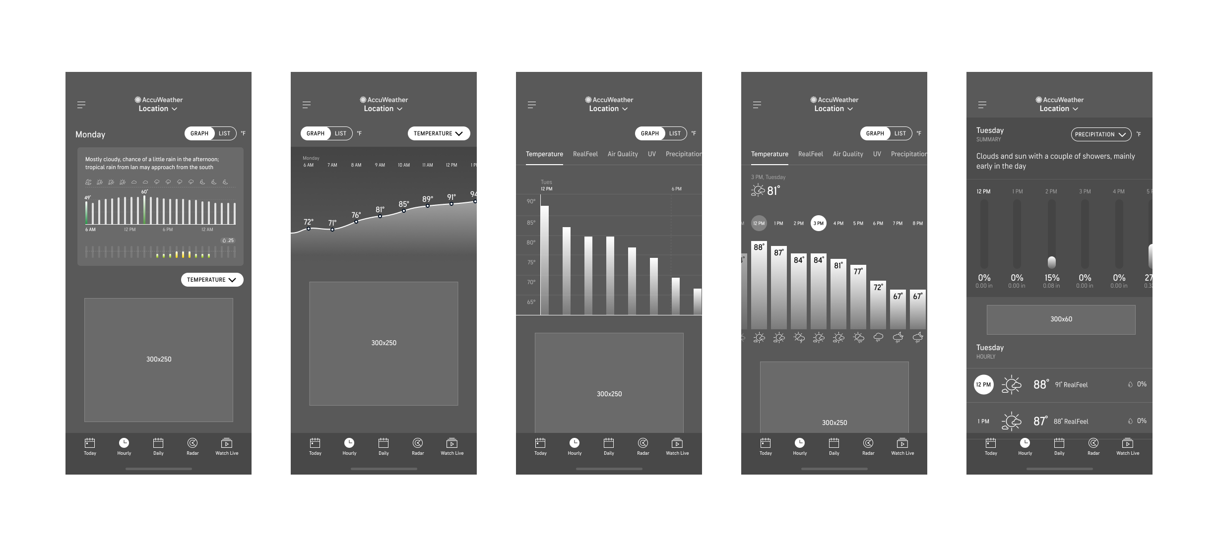
Explored ad placement – all options include an extra ad on top of the usual 300×250 at the bottom of the page.
Explored contextual upsell opportunities as to not disrupt the weather viewing experience too much.
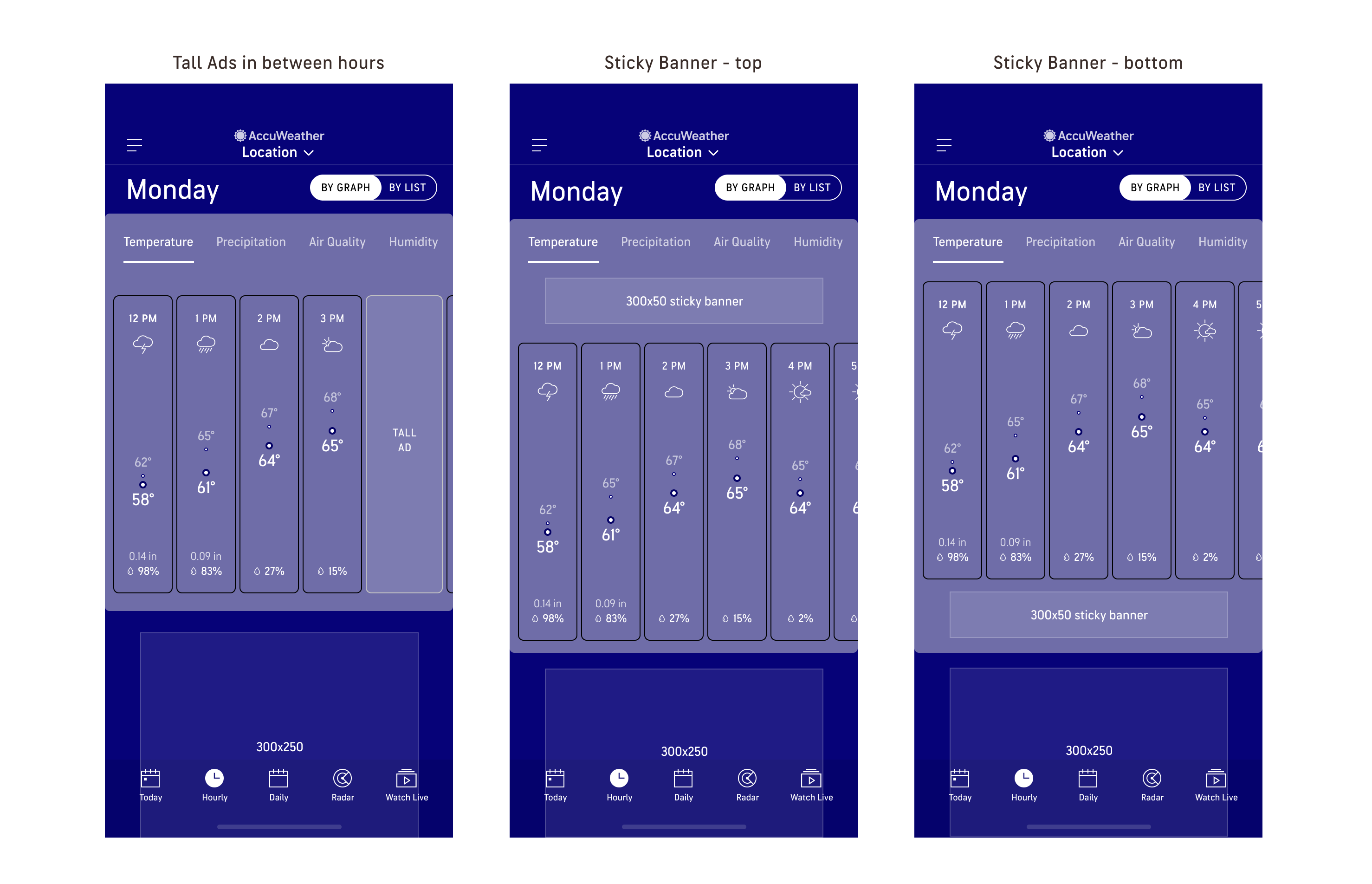
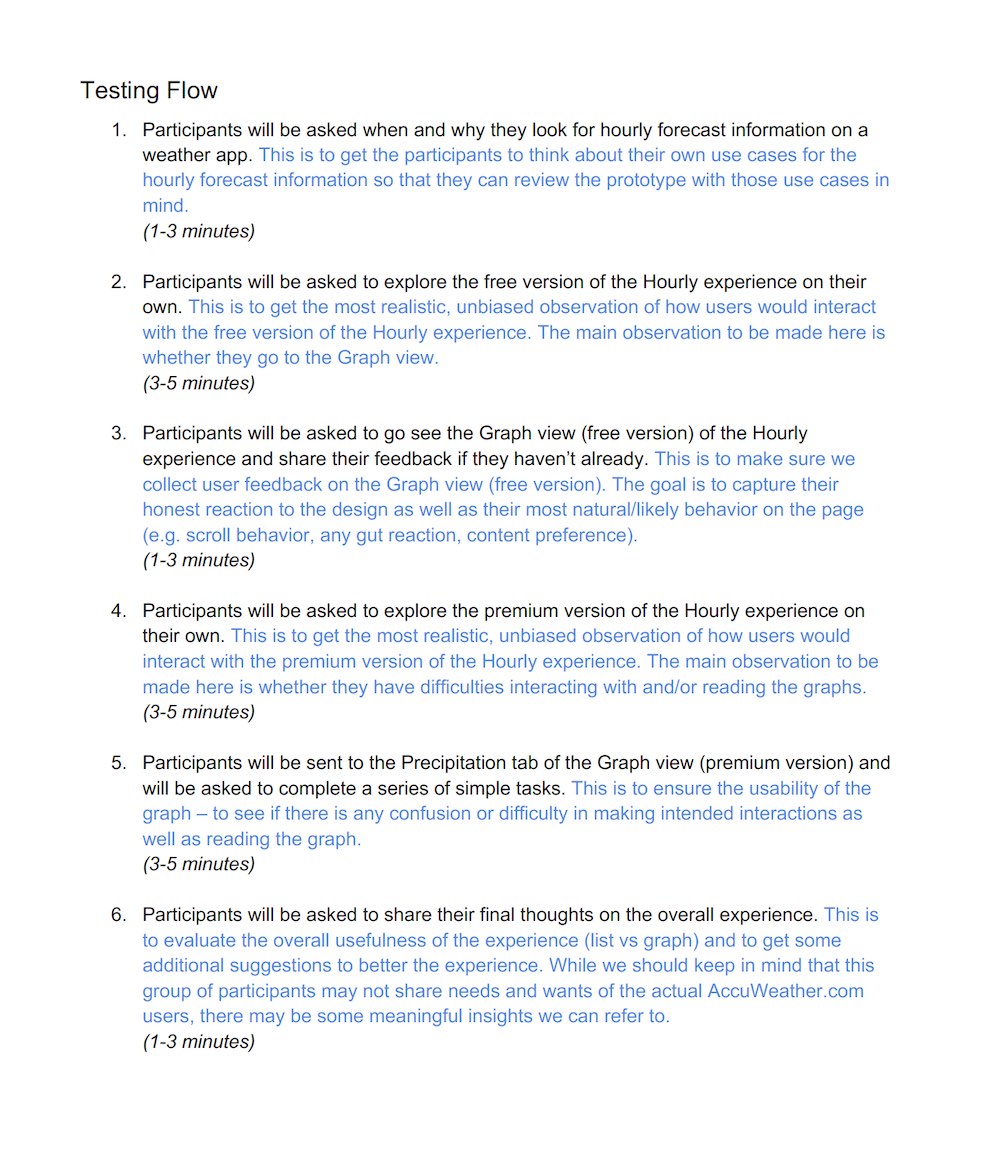
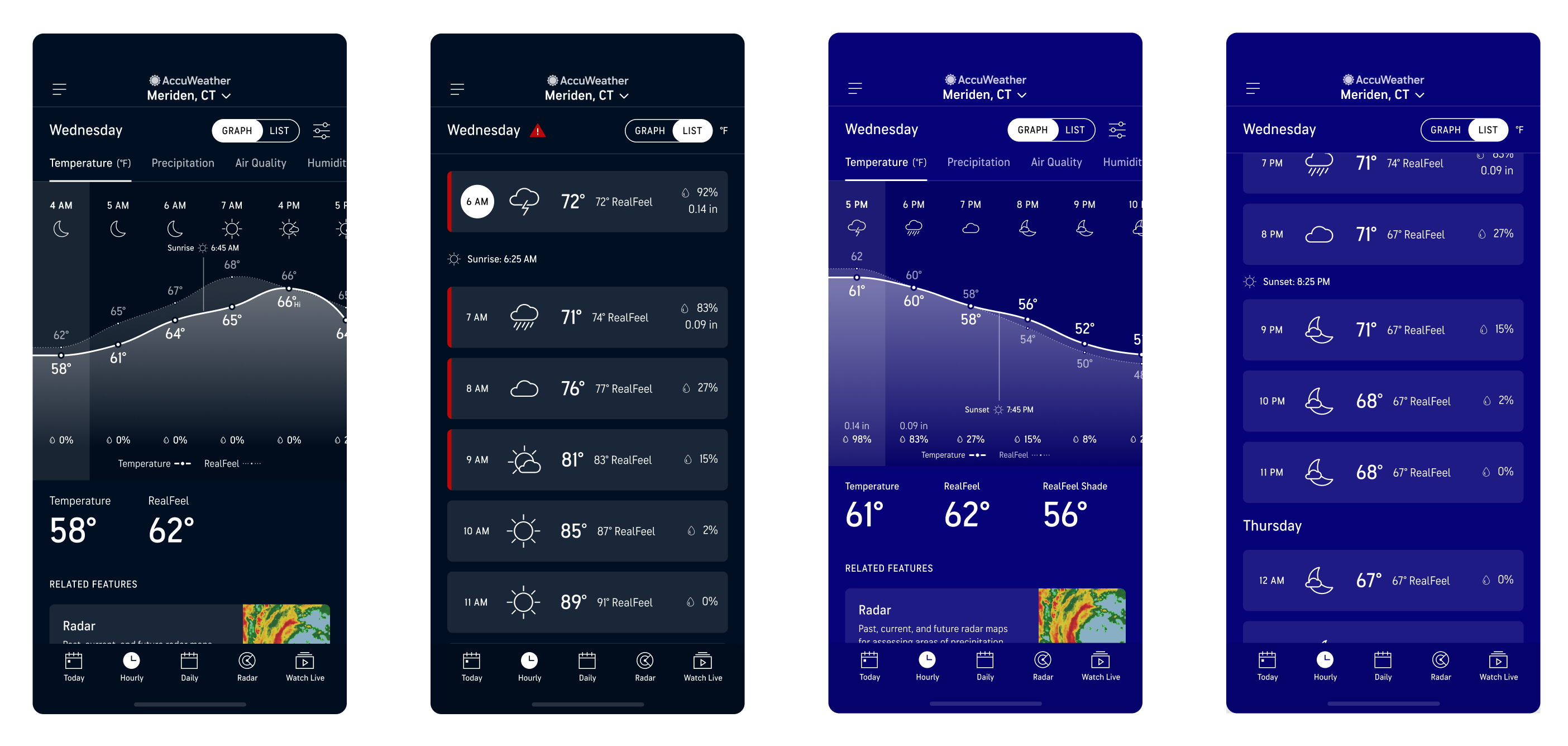
Final UX – Free experience
After multiple design reviews with cross functional teams, feedback was incorporated into the final UX which includes:
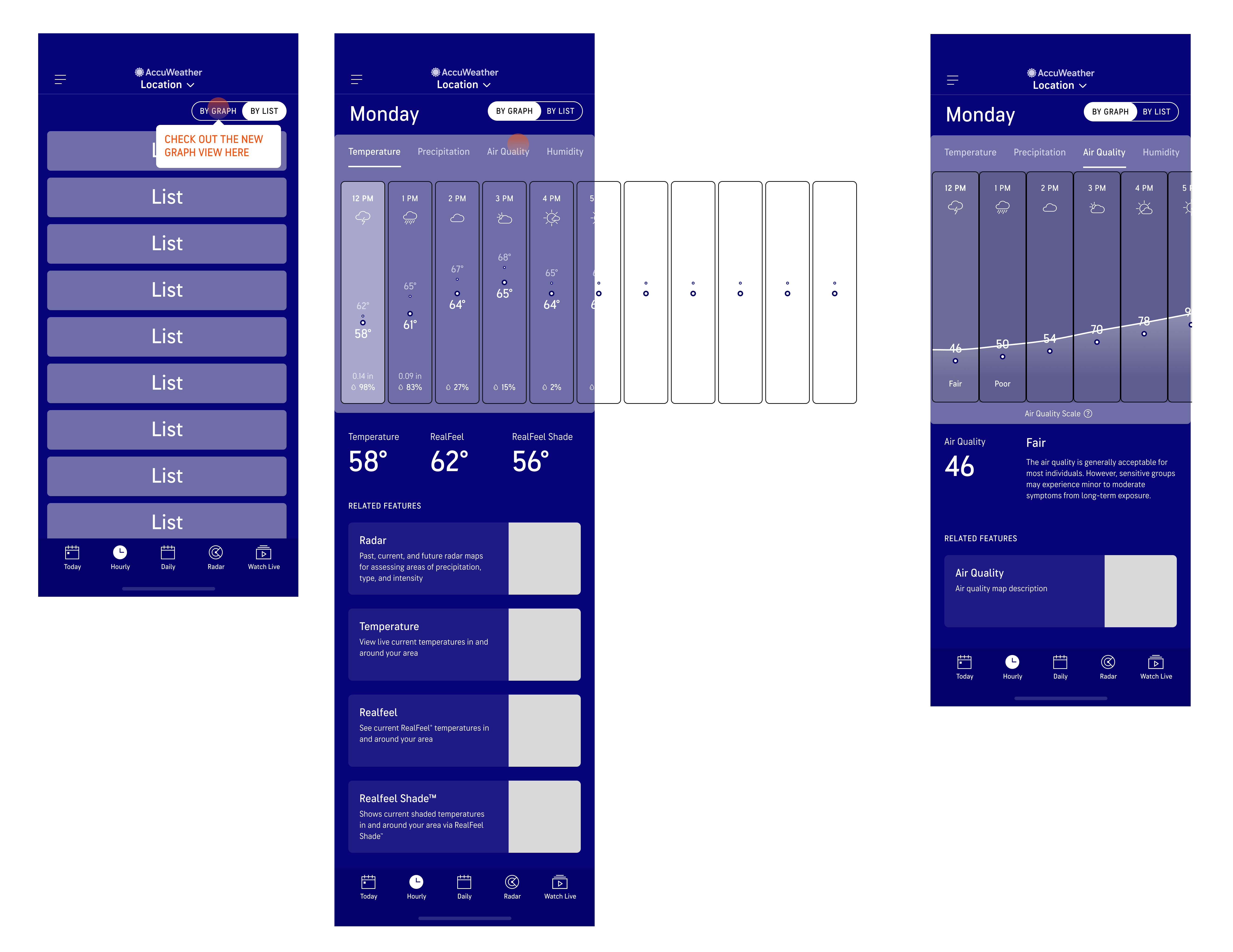
- Tooltip on the List view to inform users of the new Graph view
- Hours on List view look more tappable than before
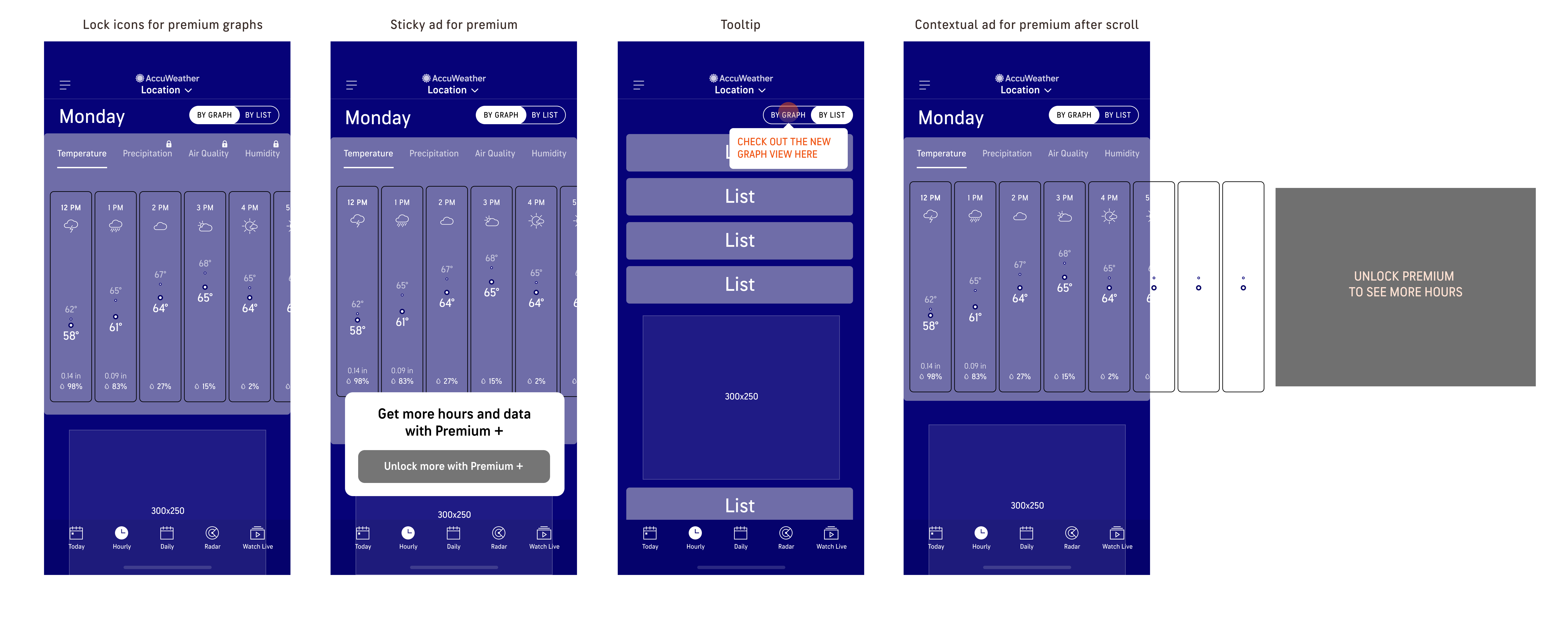
- Locked icons to show unavailable graphs for free users
- Contextual upsell at the end of the free Temperature graph
- Related maps under the ad for more contextual weather data

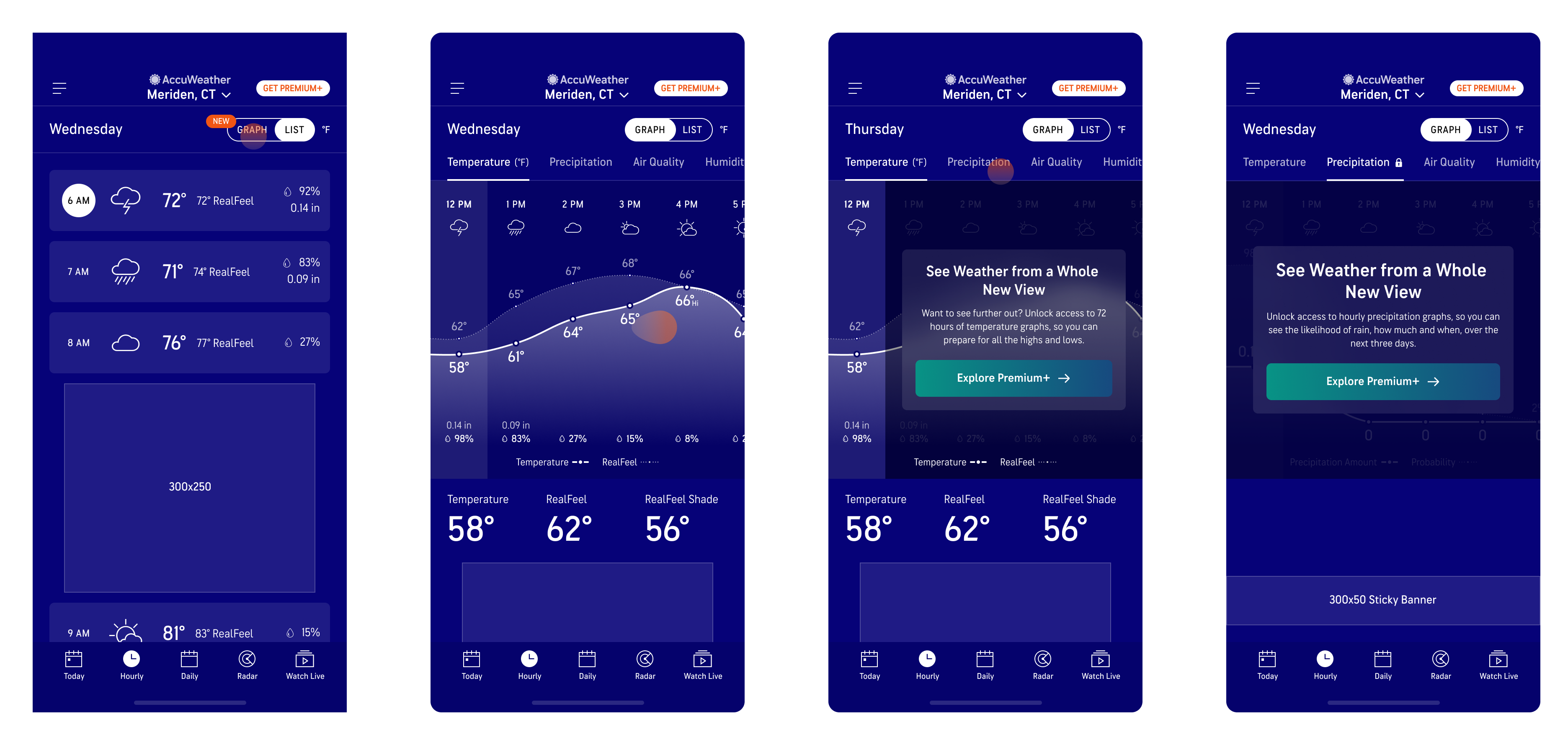
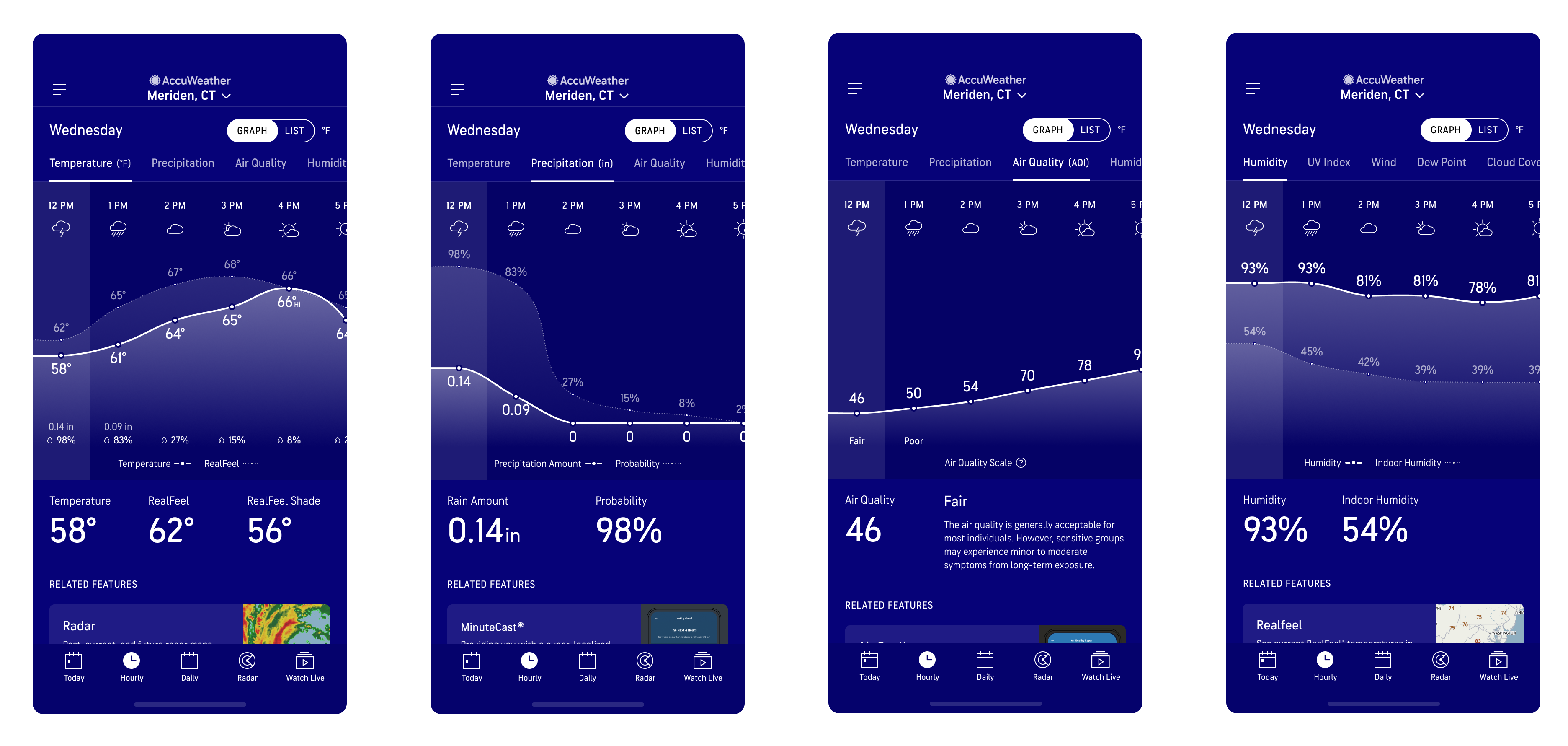
Final UX – Premium Experience
For the Premium experience, users will still get all of the same content as free users without the ads. They will also have access to all other hourly graphs (Temperature, Precipitation, Air Quality, Humidity, UV Index, Wind, Dew Point, Cloud Cover, and Visibility).
First High Fidelity Designs
User Testing
After multiple rounds of reviews with Design, Product, Meteorology, and Development teams, we created a working prototype for both the free and paid tier versions to validate the usability and desirability for the experience.
Usability Study Details
- Research goal: observe users’ interactions with the redesigned Hourly experience and identify any usability issues
- 20 Unmoderated tests via PlaybookUX
- 1 prototype (consisting of both free AND premium version of the hourly experience)
- Participants recruited from PlaybookUX platform and screened for those who visited weather apps at least once in the past 30 days
- Participants were of mixed age, gender, and incomes.
Usability Study Findings

Positive Insights
- Roughly 3 out of 4 people interacted with the prototype as it was intended, without being prompted.
- 60% checked out other tabs, seeing the upselling CTA on those premium tabs.
- Participants liked the Graph view for its clear visual presentation as well as the amount of information shown at a glance.
Observations
- Some elements/interactions were overlooked. Only 55% saw the upselling CTA at the end of the free Temp graph and only 30% tapped on a specific hour and saw the Hourly sheet.
- 65% said they would not upgrade or would need more information to decide.
Usability Study Clip
Notable Quotes from users who preferred the Graph view
“I can see a lot of information at once without having to scroll with a graph compared to the List view.”
Everett, 39
“I would pay up to $2.99 for premium+, specifically for Precipitation and Humidity graphs.”
Allie, 28
“Graph view is better because you’re getting the most information, “best of both worlds,” and I love being able to visually see the high and lows at once.”
Krishna, 27
Post Usability Study Revisions
- Add more vertical spacing between the legend and the graph so that the legend doesn’t get lost
- Make the day info (e.g. “Wednesday”) on the Graph view sticky when scrolling for better context
- Update the Graph view guide to be a 2-step guide (1. Slide to see more hours, 2. Tap on each hour to learn more) to highlight main functionalities
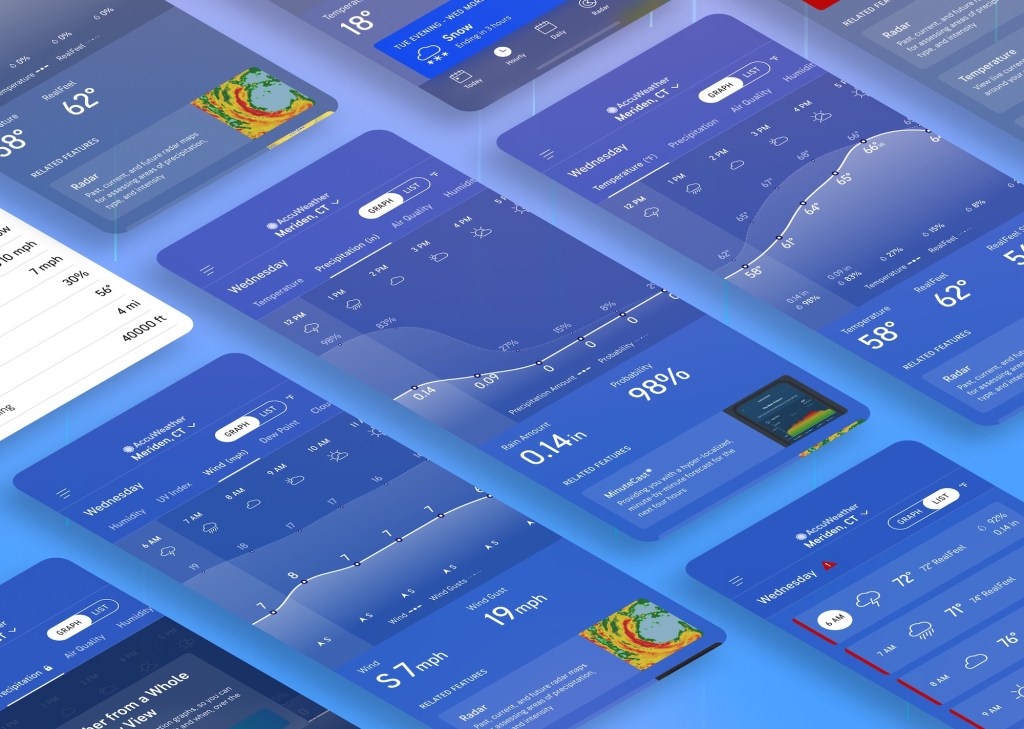
Final Designs
Paid Tier (Premium) Experience
Final Core Experience – Free User
Final Core Experience – Premium User
All Graphs
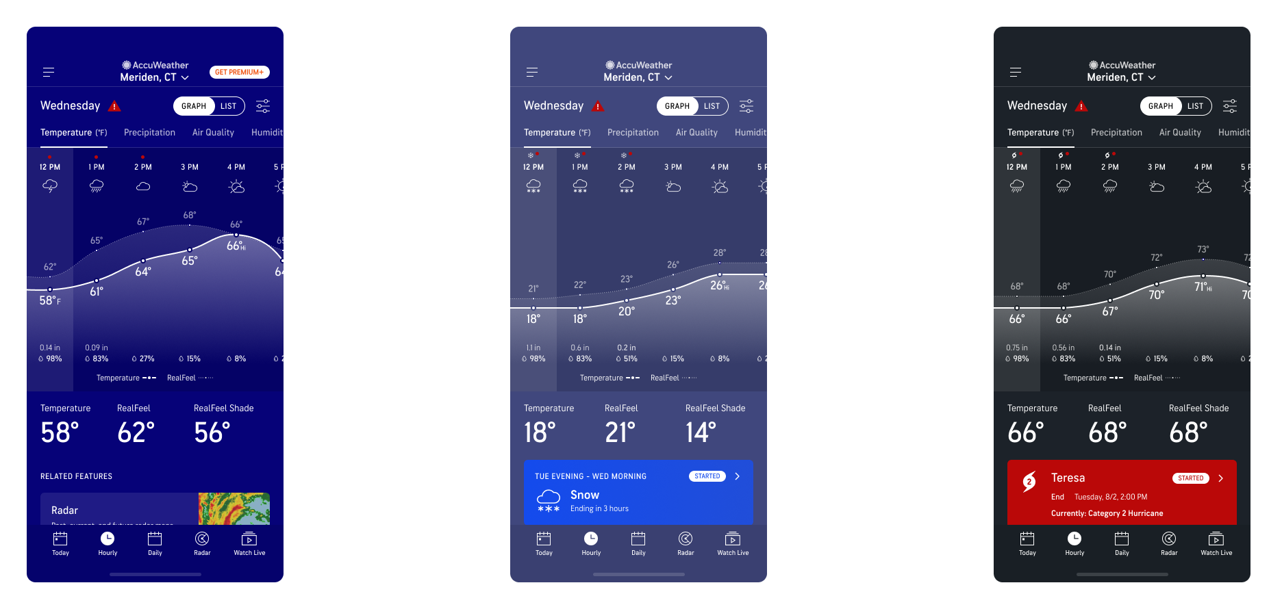
Sunrise and Sunset – Graph and List views
Alerts on Graph view – Government, Winter, and Hurricane Alerts
Results
Revenue Impacts:
- Mobile subscription gross revenue increased from $150k monthly to a peak of $1.1m monthly.
- Record high traffic to subscription upsell landing page compared to all other upsell entries combined
- Two record breaking days for subscriptions the same month the hourly page was launched
- Exceeded monthly subscription/revenue goals by 25%
Business Impacts
- Created positivity and motivation to create more interactive graphs across other features
- Appetite to mirror the Hourly Redesign’s success on the AccuWeather web products
Learnings
What I learned from this project is the power of contextual upsell placement and that quality > quantity of Premium ads. With already over 200,000 new paid subscribers with this one new feature that exceeded monthly revenue goals by 25%, I believe the numbers will only climb higher as more new users find the seamless upsell to upgrade their weather experience.
