Overhaul Onboarding to Increase User Retention
The goal is to increase user retention by improving the first-time user experience by rethinking our onboarding experience and replacing it with a simplified, friendly setup flow that we can use to launch a user into the app in the right mindset.
Role
UI/UX
Timeline
2 months
Programs
Figma
Date Completed
January 2023
High Level Result:
First time install retention increased by 40% and long-term user retention increase by 25%, increasing overall user engagement to 2x the previous averages.
The Problem
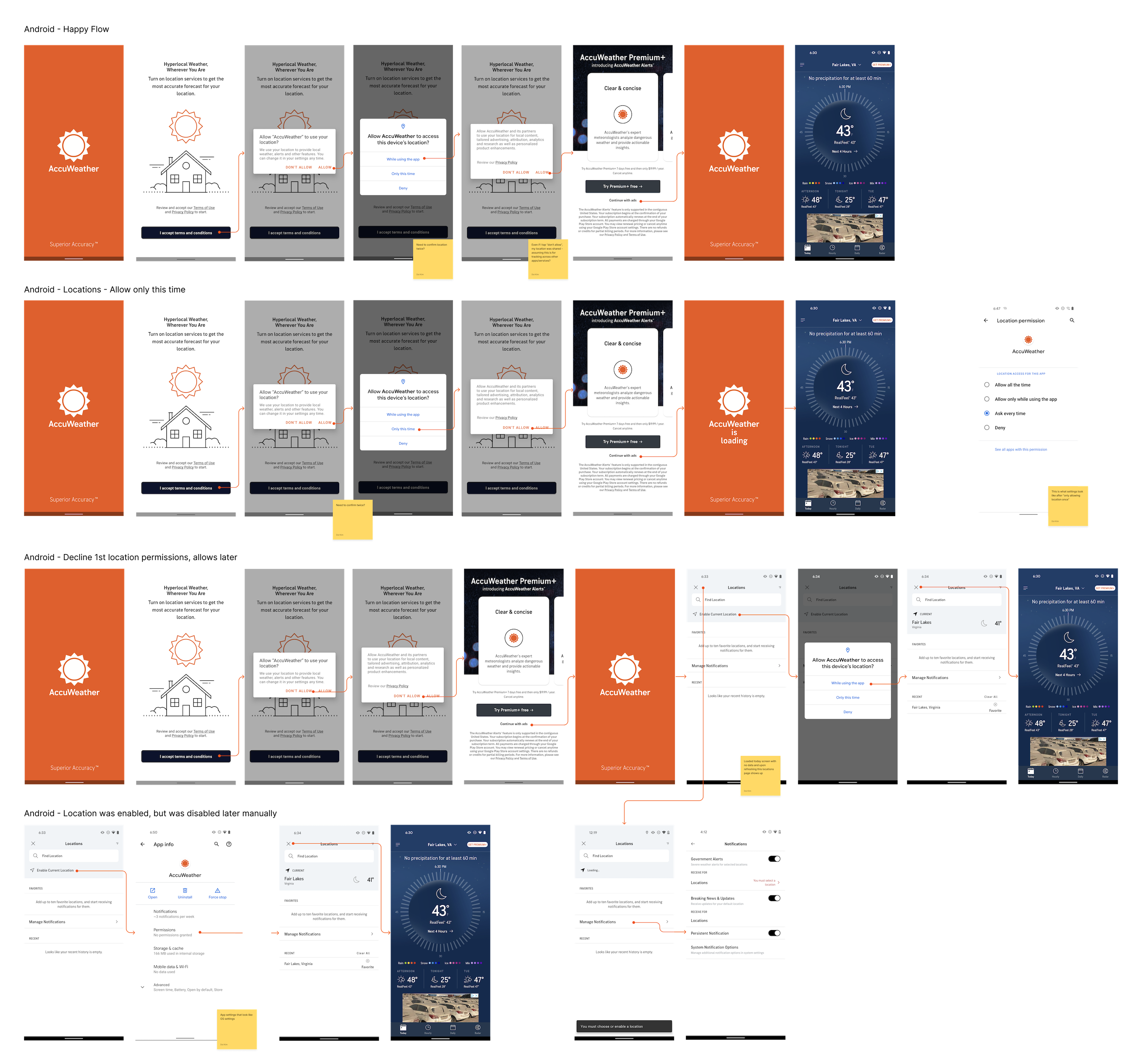
Between Jan-Oct 2022, 40% of iOS and 46% of Android users declined the upsell offer to start a free trial during onboarding. We also saw 46% of iOS and 39% of Android users exit onboarding in the middle of the flow, meaning we lost them as users who didn’t want to complete the onboarding flow.
The two experiences (iOS and Android) were also designed and implemented in a silo, making the experiences incohesive.
The Goals
- Increase user retention and onboarding completion rate.
- Reduce stickiness by making the onboarding process intuitive and easy.
Research
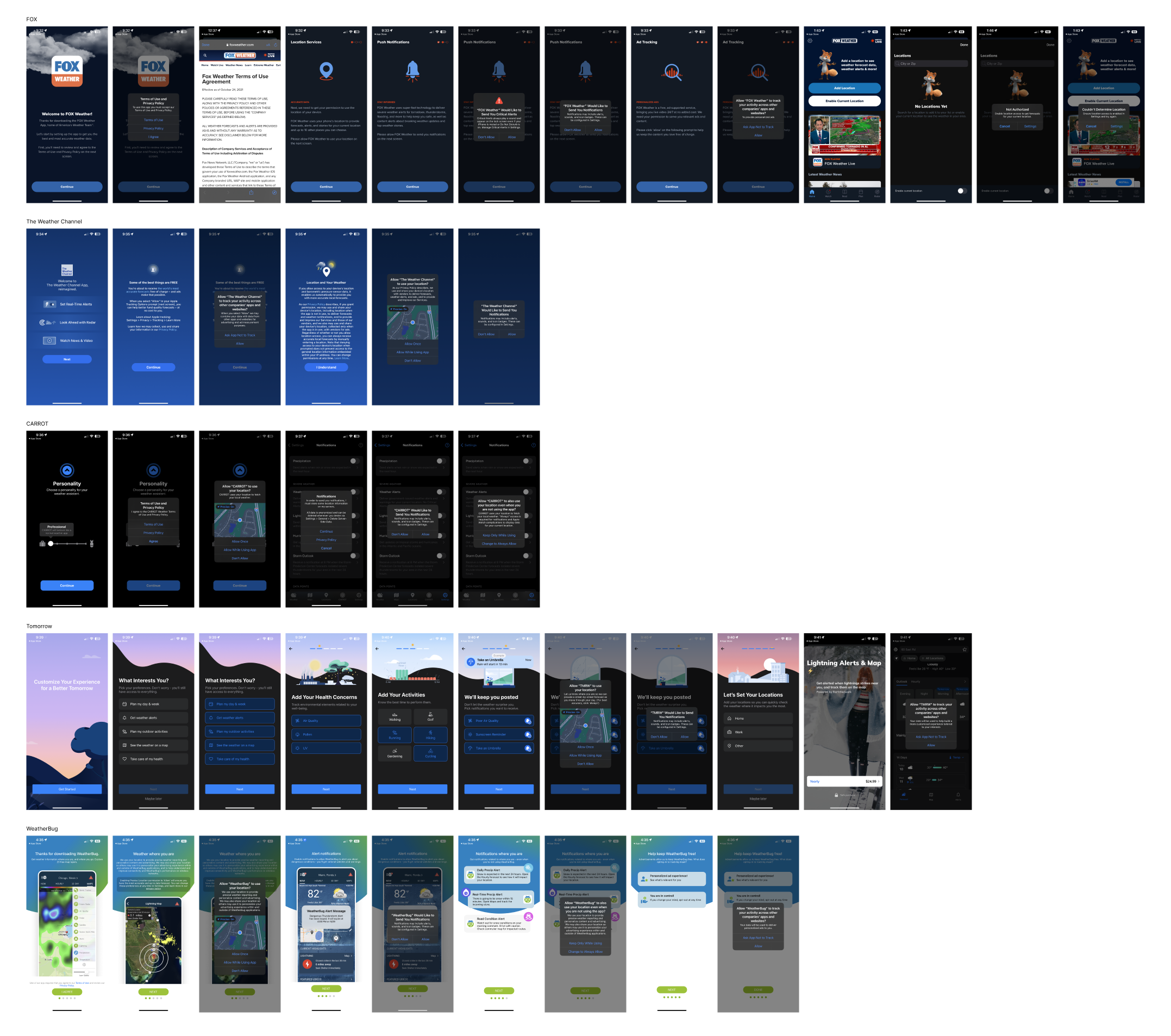
Competitor Analysis
Most of our weather app competitors followed the pattern of [full screen explanation > OS prompt]. Fox had the longest onboarding process but the process didn’t feel as long because of the simple steps and icons on each step. All competitors also had clear buttons for each step that allowed for a lighter cognitive load on the user, but some explanations (especially on location sharing screen) were very long. Many competitors also had their logo on the first welcome screen but omitted in future steps.
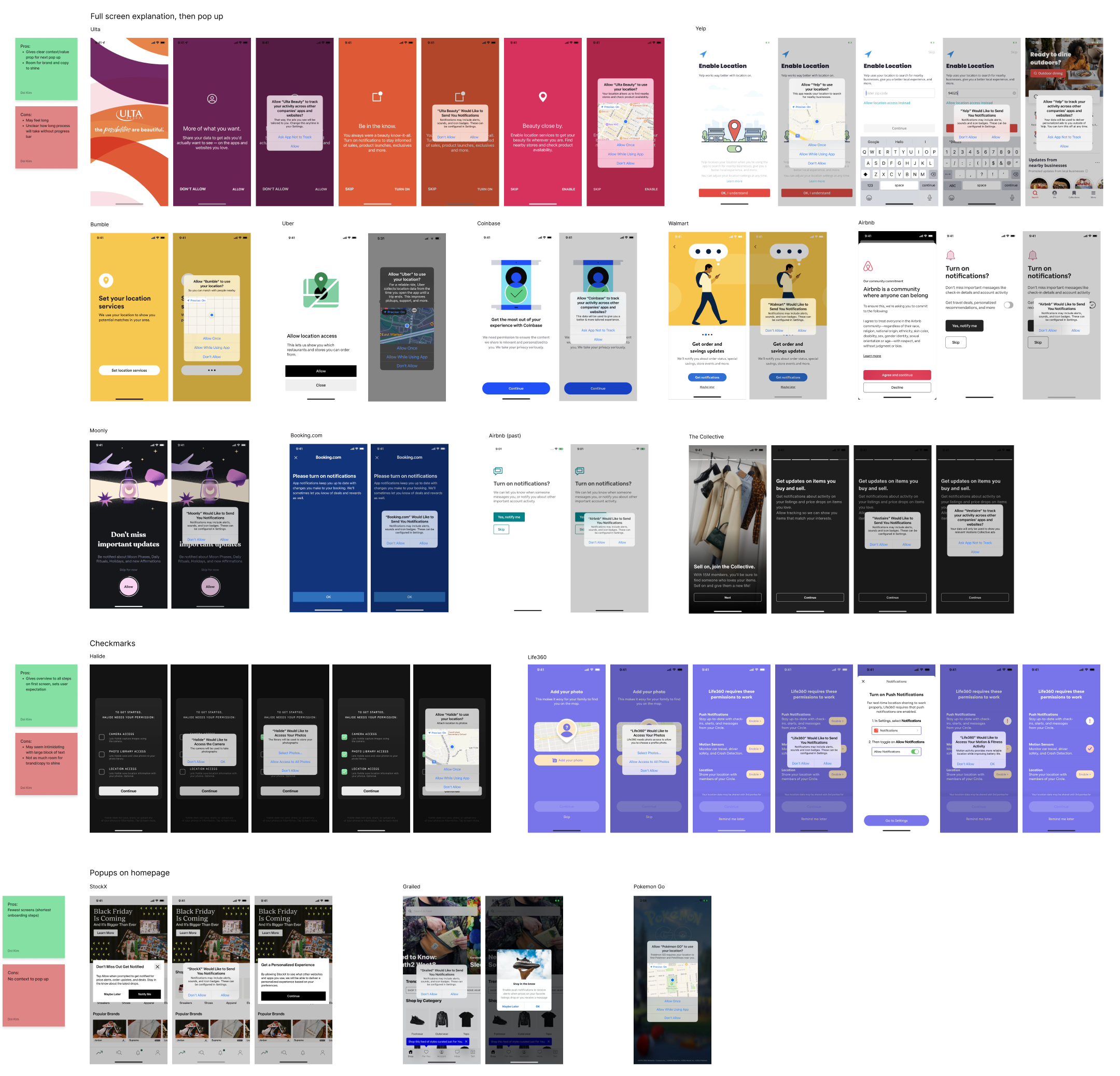
Onboarding Examples
I also looked at how other apps not related to weather did their onboarding steps and categorized them by the type of onboarding. The pros and cons are listed for each type next to the section.
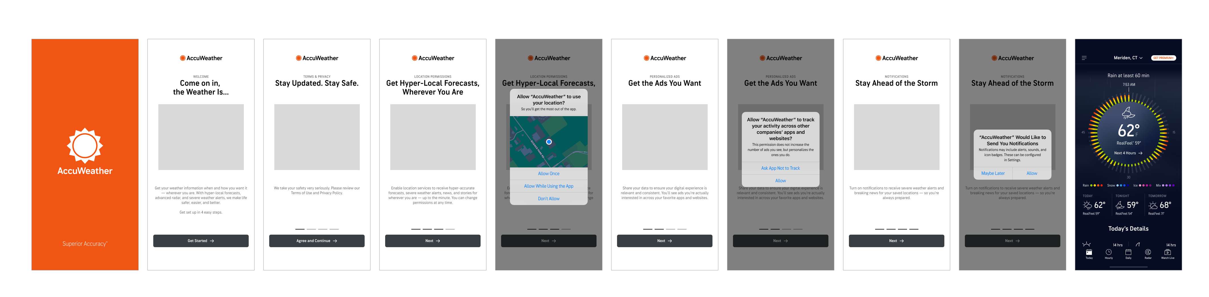
Old Experience Analysis
After research, I took a deeper dive into every possible flow of the old onboarding experience to gather the main aspects to improve on.
- Copy and imagery overhaul needed
- Headers, subtext, and buttons were unclear and the images misrepresented what we are asking from the user. (Ex: the first screen header talks about location and so does the image, but the button asks for users to agree to our terms & conditions)
- Need to remove upsell screen
- On our upsell screen (4th screen users see), only 13.5% on iOS and 14.2% on Android interacted with our “Try It, Then Subscribe” button but this is not reflective of the number that actually start the free trial by completing the purchase. The only way to skip this screen without paying the subscription fee is through the “Continue with ads” button which is minimized and hard to see. We lost many potential users because of the placement of the upsell screen.
- Need to consolidate flows for Android and iOS users
- Keep experiences consistent and easier to manage for developers and future iterations
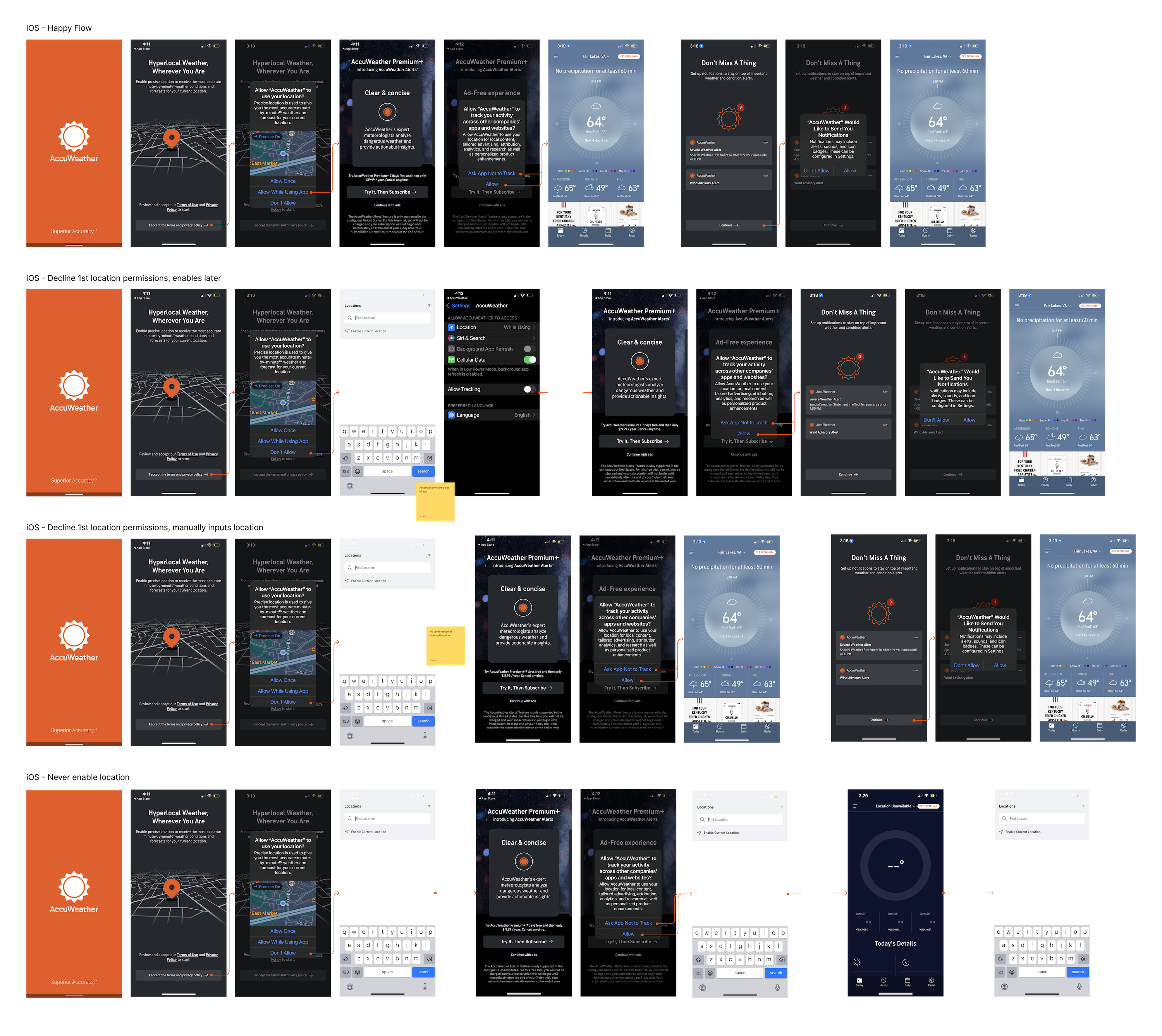
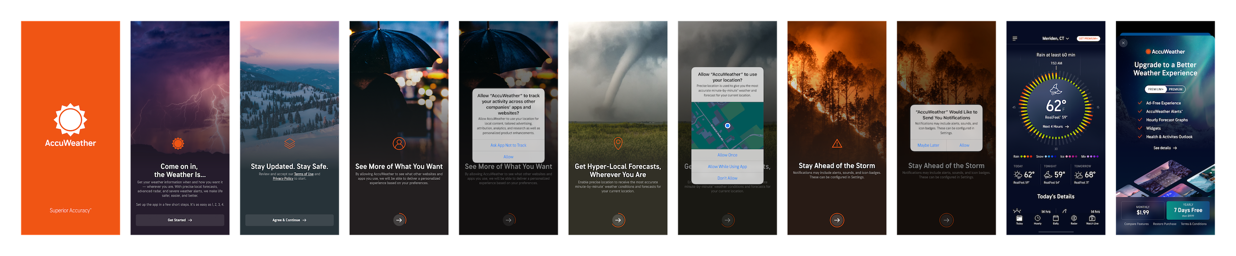
iOS Experience Analysis
Android Experience Analysis
UX Explorations
UX Philosophy
Consolidated the main UX goals after research and analysis to gain alignment from all stakeholders:
- Set user expectation by providing context and value prop for each step without being too wordy
- Connect new users to brand and set the tone for the brand
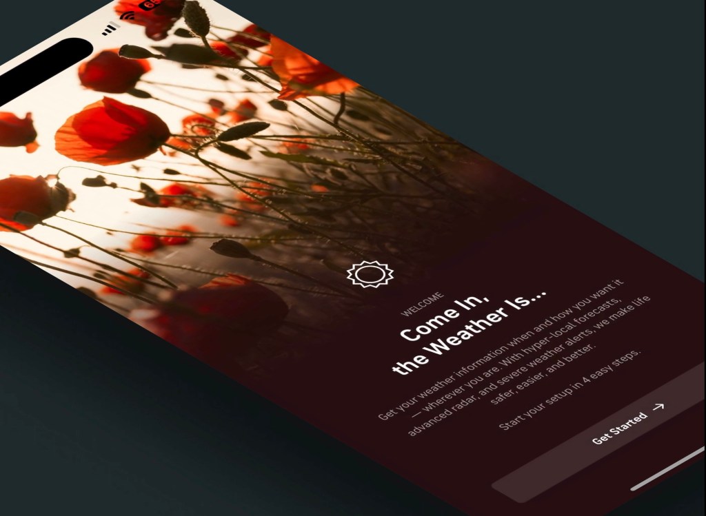
- New welcome screen
- Include AccuWeather logo on each screen
- Reduce user cognitive load and potential complications
- Fewer choices on one page (like ‘skip’ or ‘go back’)

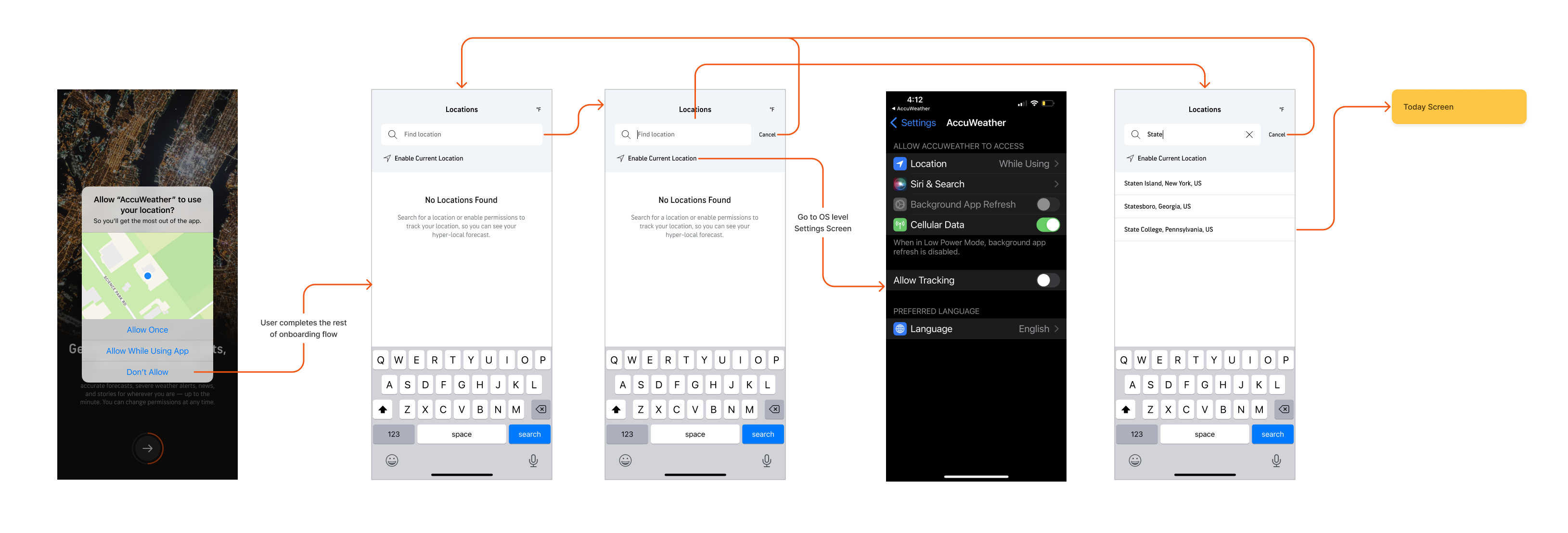
After consolidating the content of each screen/step, I led discussions around the proper order of each permissions with product and legal teams.
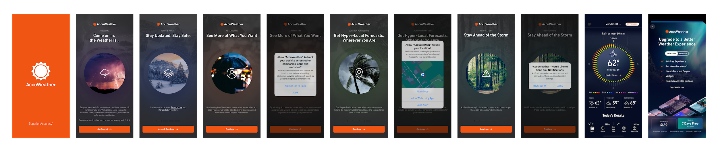
UI Explorations
Full Image Fade:
- Most eye-catching and memorable
- Icons don’t stand out as much on some images
- Different from competitors
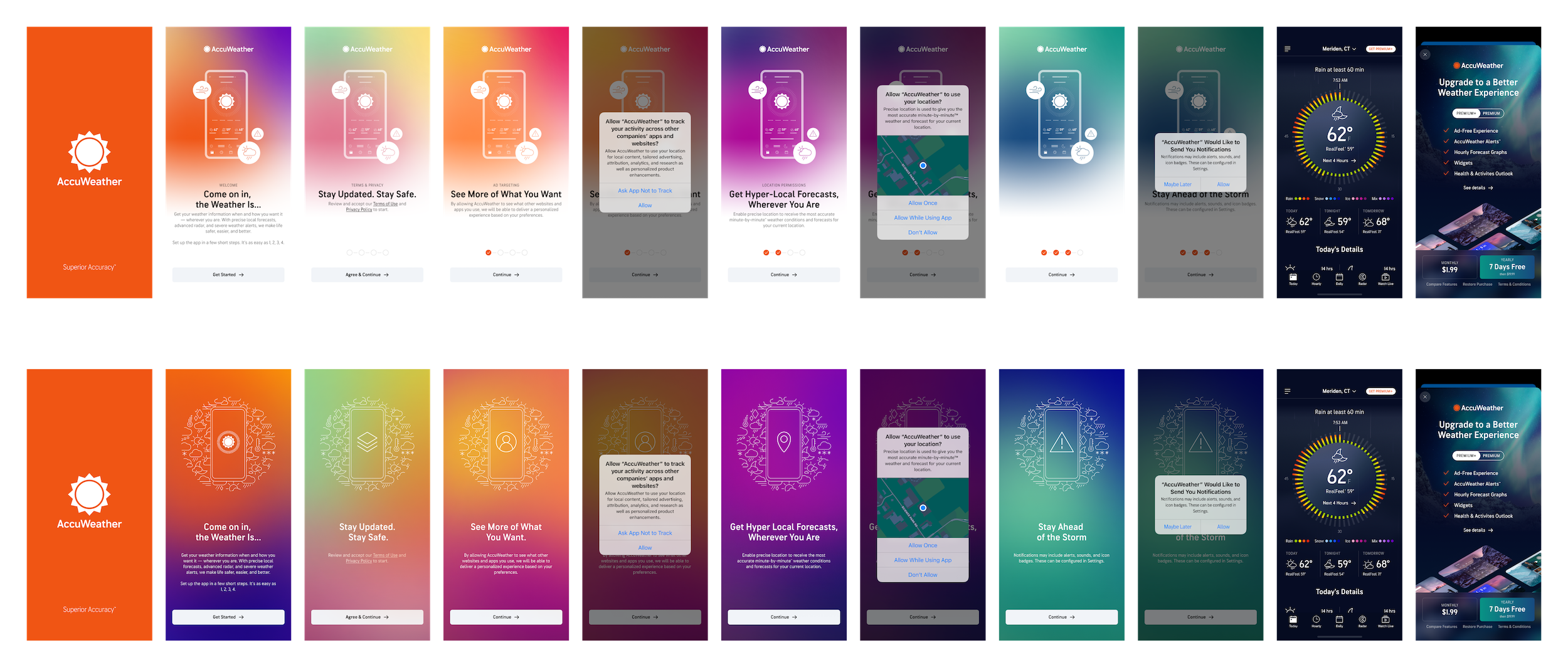
Circle Image:
- Lean into AccuWeather’s MinuteCast brand with centered circle
- Able to use eye-catching images
- Also different from competitors
Seasonal Gradients:
- Lean into brand colors and customized imagery that can provide more context to steps
- More similar to competitors’ abstract styling
- Repetitive and not as interesting
- Higher level of effort from brand team
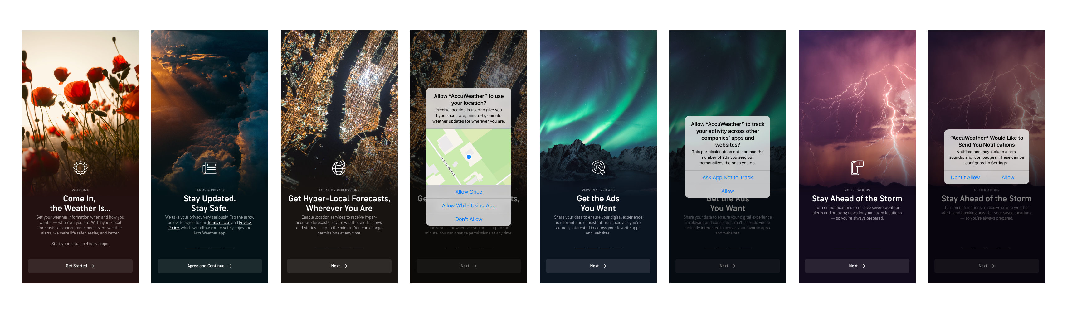
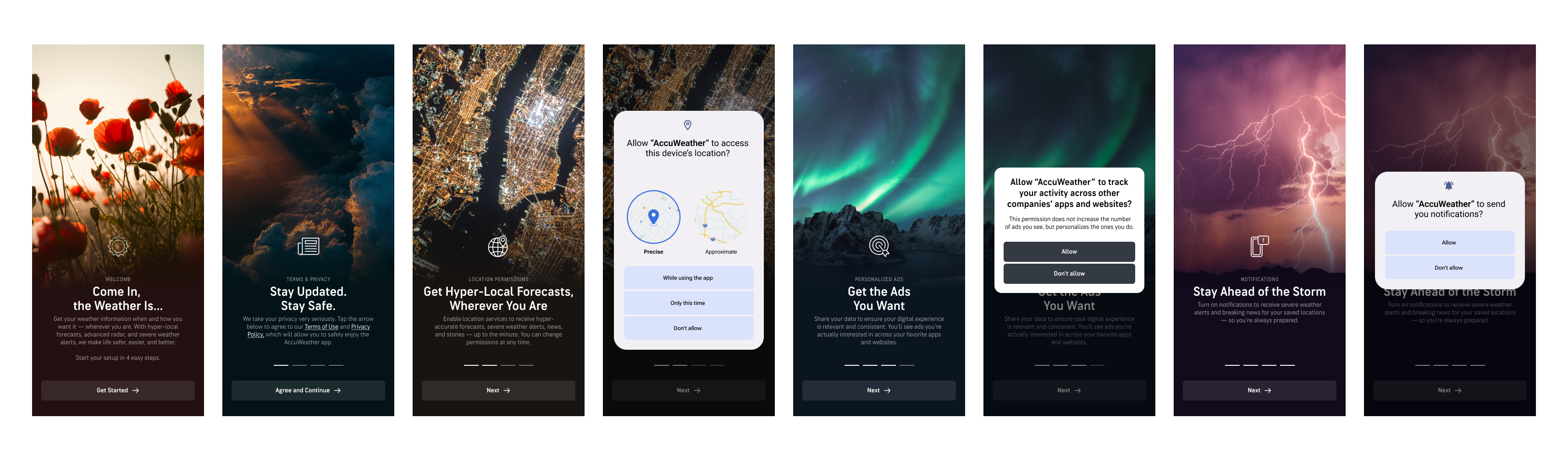
Final UX
- Welcome screen to properly introduce the AccuWeather brand to new users
- Full AccuWeather logo on each page for brand awareness
- Header with clear intentions with subheader for extra context
- Image or icon related to each permissions
- Body copy explaining value propositions for each permissions
- No skip or back buttons to keep the flow straightforward
- Order is from most important (required legally) to least important
Final Designs
Mobile – iOS
Mobile – Android
Download the AccuWeather App and experience the latest onboarding experience!
Results
Revenue Impacts:
- Increased first time install retention by 40% and long-term user retention by 25% (tracked for 6 months after launch)
- No hit to subscriptions revenue by removing upsell page from onboarding
- Average time of onboarding completion decreased from an average of 47 seconds to 20 seconds
Business Impacts
- Created confidence and motivation to include subscription upsell in contextual formats instead of pushing quantity
